
Kitchen Configurator
Shoppers building a complete kitchen suite faced overwhelming complexity across appliances, finishes, and layouts. Without a guided flow, this choice paralysis resulted in mismatched purchases and high return rates that impacted the bottom line.
Deliver a mobile-first, brand-aligned configurator that simplifies layout, style, and compatibility flows—enabling confident configurations while bridging the gap between digital discovery and in-store purchase.
The tool delivered a –25% reduction in return rates and a 15% lift in store foot traffic. By optimizing the mobile completion flow, we empowered users to finalize complex specs before ever stepping into a showroom.
Configurator Ideation & Audit
I began by conducting a deep competitive analysis and auditing the existing flow logic to isolate the friction points causing choice paralysis. The audit revealed three core failures: incompatible product combinations, a lack of spatial visualization, and an overwhelming cognitive load due to unstructured option grouping.
- Bundling vs. Single-Item: Tested grouped appliance sets against individual item selection to see which drove higher confidence.
- Flow Logic: Evaluated step-by-step sequential wizards against a unified, single-page "hub" configurator.
- Feedback Loops: Explored real-time 3D previews versus static high-fidelity grids for compatibility validation.
Using Axure RP, I built high-fidelity modular interaction patterns. This allowed us to stress-test complex logic—such as finish compatibility and dimension constraints—across mobile and desktop environments before moving to final visual design.
Initial UX Explorations
Early concepts focused on reducing cognitive load and helping users build confidence while configuring complex appliance suites.
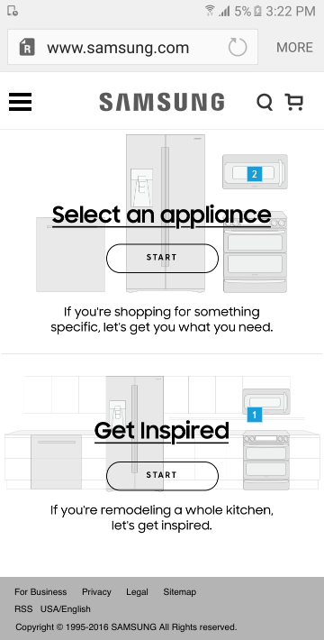
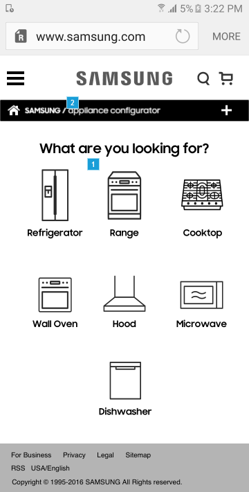
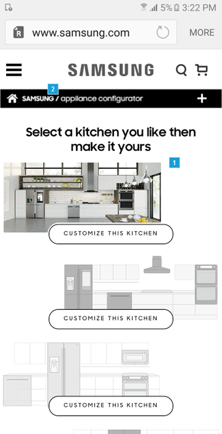
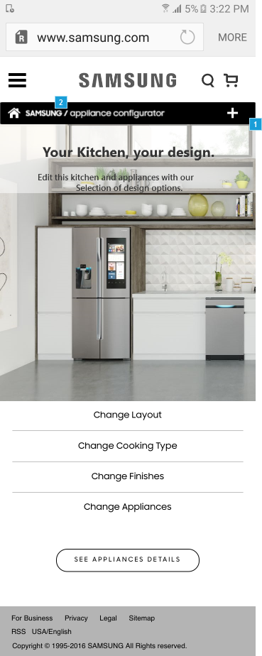
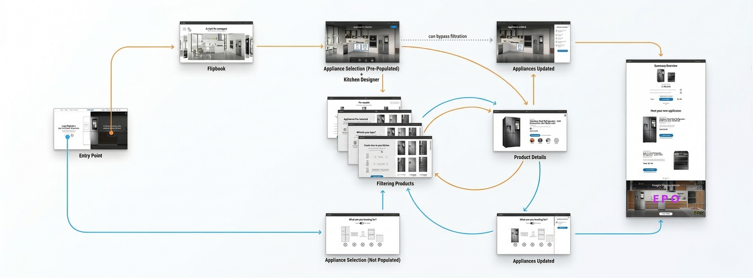
A system-driven configurator guiding users through compatible appliance combinations.
Configurator Logic
To handle complexity without overwhelming the user, I designed an incremental flow: Layout → Appliances → Finishes → Preview.
Initial explorations focused on simplifying decision paths and clarifying product relationships through custom modular structures.
View Axure PrototypeShipping the Configuration Engine
Delivered MVP
- Dynamic Selection: Seamless layout and finish selector.
- Logic Engine: Real-time compatibility checks to prevent invalid bundles.
- Live Preview: Instant visual summary of kitchen configurations.
- Frictionless UX: Checkout-ready design optimized for conversion.
Workflow Impact
The delivery prioritized technical feasibility and high performance, resulting in zero major redesigns post-development.
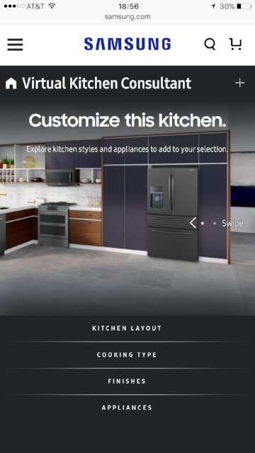
Shipped Experience
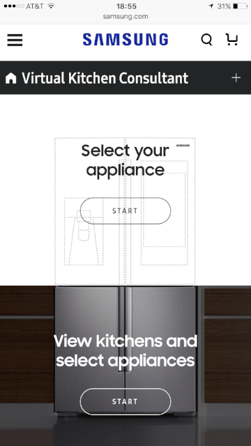
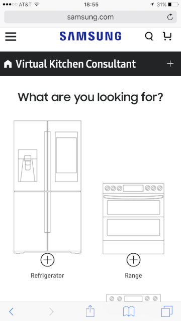
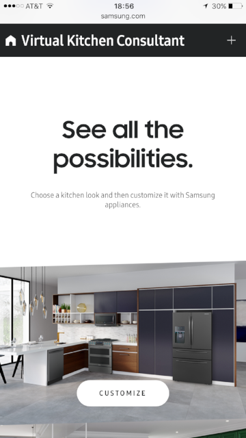
The responsive UI simplified complex choices and reduced friction—especially on mobile.
Results & Impact
The project successfully bridged the gap between digital configuration and physical retail. By leveraging a system-inspired approach, we ensured immediate performance gains while establishing a scalable framework for future Samsung kitchen experiments.
Team & Role
I led UX research, interaction design, prototyping, and final UI—ensuring user clarity while mentoring the team on scalable patterns.
The configurator introduced system-driven product selection, reducing cognitive load while ensuring compatible appliance bundles, improving both user confidence and operational efficiency.
Designing for ambiguity with complex product combinations taught me to prioritize simplicity, guided flows, and clarity of choice. It reinforced that a strong UX mindset transcends tools.
This experience laid the foundation for my later work building and scaling formal design systems at Harry’s and Flamingo, proving that systemic thinking is the ultimate driver of efficiency.

